The font is often the last thing decided in an Arabic project, and the first thing an Arabic reader notices. A font that looks elegant to a European eye can be hard to read, miss letters or break words in the wrong places. Here is what to check before choosing Arabic fonts for print and for the web.
1. Check that the font really supports Arabic
Many popular fonts have no Arabic characters at all: the software then replaces them with a system font, and the layout changes without warning. A good Arabic font contains all the letter forms (each letter changes shape at the beginning, middle and end of a word), the ligatures, the vowel marks and both digit systems. Test it with real text, not with a few sample words.
2. Choose the right style for the text
- Naskh-style fonts: the standard for running text, books, manuals and contracts; very readable at small sizes.
- Kufi-style and geometric fonts: modern and clean, good for titles, logos, packaging and interfaces.
- Calligraphic styles (Thuluth, Diwani): beautiful for headings or decoration, but not for long texts or small sizes.
3. Size and line spacing are different from Latin
At the same point size, Arabic letters usually look smaller than Latin ones, and vowel marks need space above and below the line. Arabic text often needs a slightly larger size and more line spacing than the Latin version. If you keep the Latin settings, the Arabic text looks cramped and vowel marks may touch the line above.
4. Pair Arabic and Latin fonts
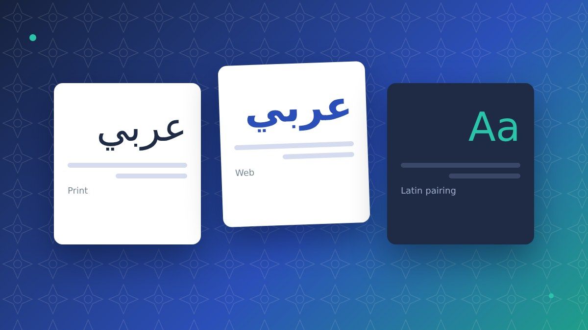
In bilingual documents and websites the Arabic and Latin fonts must look like a family: similar weight, similar contrast, similar height. Several type families are designed with both scripts. If you combine two different fonts, compare them side by side at the sizes you will actually use.
5. Weights for titles, text and tables
Many free Arabic fonts have only one or two weights. Catalogues, websites and packaging usually need at least regular, medium and bold, sometimes also light for large titles. Check the weights before designing, not after.
6. Licences
A font installed on a computer is not automatically licensed for every use. Desktop, web, app and packaging use can require different licences. Ask for the licence file and check that it covers the way you will use the font, also in the countries where the product is sold.
7. Fonts on the web
Arabic web fonts are heavier than Latin ones. Load only the weights you use, prefer modern formats such as WOFF2 and set a fallback font so the text is readable while the font loads. The page must also be set to right-to-left. See our guide to Arabic website localization.
Checklist
- Full Arabic support tested with real text
- Style suitable for running text or titles
- Larger size and more line spacing than Latin
- Arabic and Latin fonts that work together
- All the weights you need
- Licence valid for print, web and packaging
- Web fonts optimised, with a fallback
How we work
Our Arabic DTP team chooses or checks the fonts with you, adapts sizes and spacing for Arabic and delivers print-ready or web-ready files. Read also the 7 most common Arabic DTP mistakes or request a free quote.
FAQ
Can we use the same font as our Latin brand font?
Only if the family includes Arabic. Otherwise we suggest an Arabic font with a similar look, so the brand stays recognisable in both scripts.
Why does Arabic text look broken in our PDF?
Usually the font does not support Arabic or the software was not set for right-to-left text, so letters are not joined. The text must be set again with a suitable font and settings.
Do you provide the fonts?
We work with fonts you already own or suggest options with suitable licences, including free fonts with open licences.