An Arabic brochure, manual or package can be perfectly translated and still look wrong on the page. Arabic is written from right to left, its letters join and change shape, and it shares the line with Latin brand names and numbers. This guide to Arabic DTP covers the seven layout mistakes we see most often in Arabic files, and how to avoid each of them before your material goes to print or online.
1. The layout is not mirrored for right-to-left reading
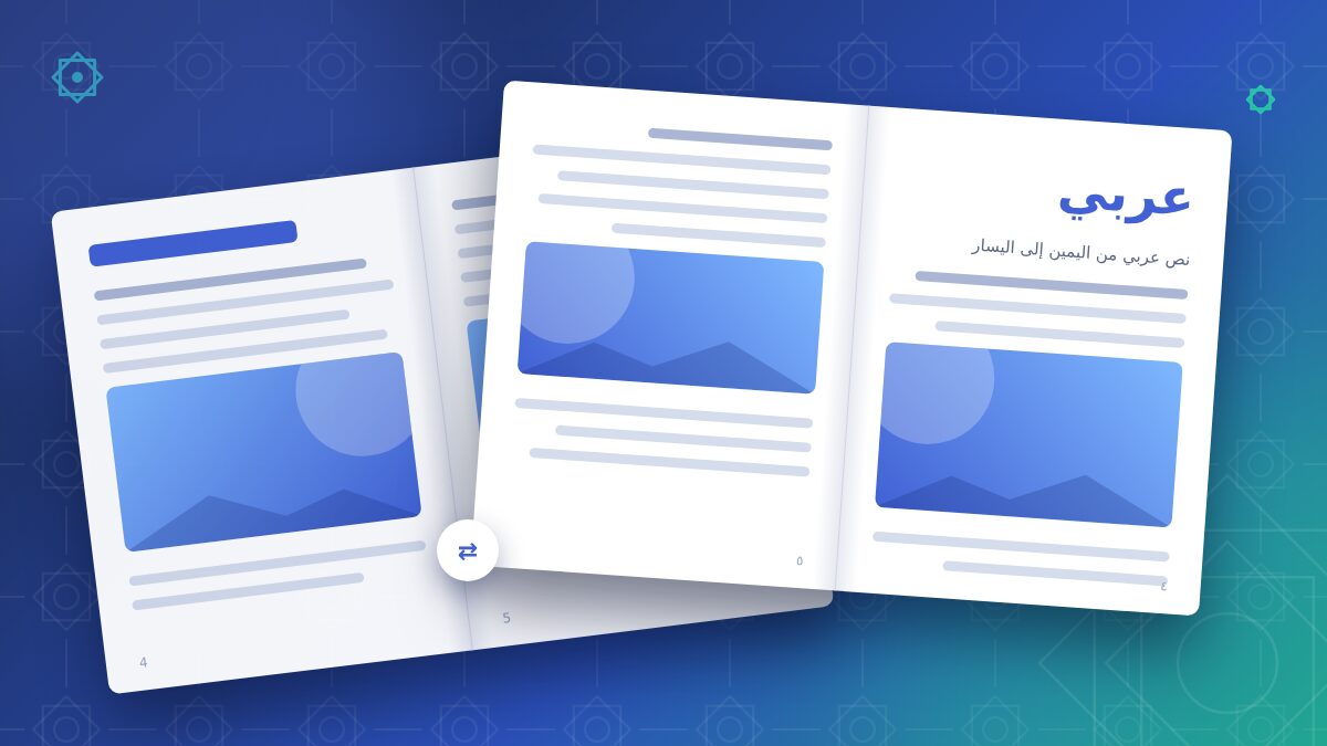
The most visible mistake is setting Arabic text inside a layout built for left-to-right reading. The words may be right-aligned, but the page still flows the wrong way: the main image sits where a European reader starts, columns are read in the wrong order, and in a booklet the binding is on the wrong side. An Arabic reader starts at the top right and moves leftwards, and an Arabic publication opens from what a European would call the back.
How to avoid it: plan the Arabic version as a mirrored layout, not as a text replacement. Set the paragraph direction to right-to-left (not just right alignment), mirror the column order, margins and page order, and flip elements that carry direction, such as arrows, timelines, step sequences and progress bars. Do not mirror everything blindly: logos, photos, product shots and most charts normally stay as they are.
2. Wrong or missing Arabic fonts
Many attractive fonts contain no Arabic characters at all. When the chosen font lacks them, the software silently substitutes a fallback font, or shows empty boxes. Other fonts include Arabic glyphs but not the OpenType features that handle contextual shaping and the placement of diacritics, so letters do not connect as they should.
Every Arabic letter can take different forms depending on its position in the word (isolated, initial, medial, final), and six letters (ا د ذ ر ز و) never join to the letter that follows. A proper Arabic font handles all of this automatically; a poor one does not.
How to avoid it: choose an Arabic typeface that matches the style of your Latin font in weight and tone, check that it is licensed for your use (print, embedding, web), and define it in your paragraph and character styles instead of relying on substitution.
3. Broken letter shaping from copy-paste or unsupported software
A classic symptom: the Arabic text appears with disconnected letters, or in reverse order, as if read in a mirror. This usually happens when Arabic is pasted into an application or a composer that does not support right-to-left text, or when text is copied out of a PDF in which the letters were stored as separate shapes.
Use the right settings in InDesign and Illustrator
Older InDesign releases needed a dedicated Middle Eastern edition for Arabic. Current versions include the features, but the paragraph must use the World-Ready (Adobe World-Ready Paragraph or Single-line) Composer and right-to-left paragraph direction. In Illustrator, the Middle Eastern options have to be enabled in the type preferences before Arabic text behaves correctly.
How to avoid it: import the translation from an editable source (DOCX, XLSX, a CAT tool export) rather than from a PDF, apply the correct composer and paragraph direction through styles, and never "fix" broken text by typing letters in reverse order: it only looks right in that one frame and breaks search, accessibility and any later edit.
4. Numbers and Latin words in the wrong place
Arabic text often contains brand names, product codes, measurements, URLs and phone numbers in Latin characters. These runs are written left to right inside a right-to-left sentence, and the software relies on the Unicode bidirectional algorithm to order them. When paragraph direction is wrong, or punctuation sits next to a Latin word, the result can be a full stop at the wrong end of the line, swapped parentheses or a product code split in two.
Digits are a separate decision. Many Arabic-speaking markets use Arabic-Indic digits (٠١٢٣٤٥٦٧٨٩), while others, especially in North Africa, normally use Western digits (0123456789). Either can be correct, but numbers are always read from left to right in both systems, so a phone number, a date range or a model number must never be reversed.
How to avoid it: decide on one digit style per project with your translator and apply it consistently, keep codes, phone numbers and ranges together as left-to-right runs, and check every line that mixes scripts, especially near punctuation.
5. Poor justification, misused kashida and letter-spacing
Justified Arabic text set with a Latin-style engine tends to show wide, uneven gaps between words. Arabic typography has its own tool for this, the kashida (tatweel): a controlled stretching of the connection between certain letters.
A frequent shortcut is typing the tatweel character (ـ) by hand to fill lines. It looks fine until the text reflows, and it breaks word search and copy-paste. The other common error is applying tracking or letter-spacing to Arabic: because Arabic letters are joined, extra spacing separates them and damages the word shapes.
How to avoid it: let the World-Ready composer handle justification and kashida through paragraph settings, avoid manual tatweel, keep tracking at zero on Arabic text, and consider right-aligned (ragged left) text for narrow columns.
6. Ignoring text length and line height
An Arabic translation rarely occupies the same space as the source. Depending on the text and the font, it can be noticeably shorter or longer, and words are often wider while lines are fewer. Arabic letters also have tall ascenders, deep descenders and, where vowels are marked, diacritics above and below the line. With the leading copied from the Latin version, lines can collide and diacritics get clipped.
How to avoid it: design flexible text frames, increase line height for Arabic (usually more generous than for Latin text at the same size), check headlines and buttons that cannot grow, and review tables, labels and packaging panels where space is tight.
7. No final check by a native Arabic linguist
Many errors only appear in the final layout: a word split by a bad line break, a sentence lost when a frame overflowed, a caption attached to the wrong image, a heading in a fallback font. Text that is part of an image, such as a screenshot, an infographic or a label photo, is easily forgotten and stays in the source language.
How to avoid it: plan a final review of the laid-out PDF by a native Arabic linguist before printing or publishing. Provide editable source files for images that contain text, and include every element in the check: headlines, captions, tables, legal notes, barcodes and packaging panels.
How we work
At Arabic Translators, native Arabic professionals translate your text, we insert it directly into your InDesign, Illustrator or other program files, mirror the layout where needed and use suitable Arabic fonts with correct letter joining. Every page gets a final layout check before delivery, in the format you prefer. Find out more about our Arabic DTP and RTL layout service or request a free quote. For background on Arabic typography, the W3C publishes the Arabic and Persian Layout Requirements.
FAQ
Should Arabic texts use Arabic-Indic or Western digits?
Both are correct; the choice depends on the target market and your house style. Arabic-Indic digits are common in many countries of the Middle East, while Western digits are usual in North Africa and in many technical documents.
Does the whole layout have to be mirrored?
No. Reading order, columns, margins, page order and directional elements such as arrows and timelines are mirrored. Logos, photos, product images and most charts usually stay as they are.
Which files should we send for an Arabic DTP project?
Ideally the original program files (for example a packaged InDesign folder with fonts and links), editable versions of images that contain text, and any style guide you use.
Can we paste the Arabic translation into our layout ourselves?
It is possible if your software supports right-to-left text and the paragraphs are set up correctly, but problems with letter joining, numbers and line breaks are common. At the very least, have the final PDF checked by a native Arabic linguist before it goes to print.